How to Read Stock Charts: A Beginner's Visual Guide
Learning how to read stock charts turns a wall of squiggly lines into a clear story: where a stock has been, who's in control, and where the risk sits. You don't need a trading degree — just a handful of building blocks. Here's a beginner-friendly walkthrough of everything on a typical chart.
The anatomy of a stock chart
Every chart shows price on the vertical axis and time on the horizontal axis. That's it at the core. The difference between charts is how they draw price over time and what extra layers — volume, moving averages, indicators — get stacked on top.
- +Price axis (Y): the dollar value of one share.
- +Time axis (X): the period each bar or candle covers — a day, an hour, a week.
- +Volume: how many shares changed hands, usually as bars along the bottom.
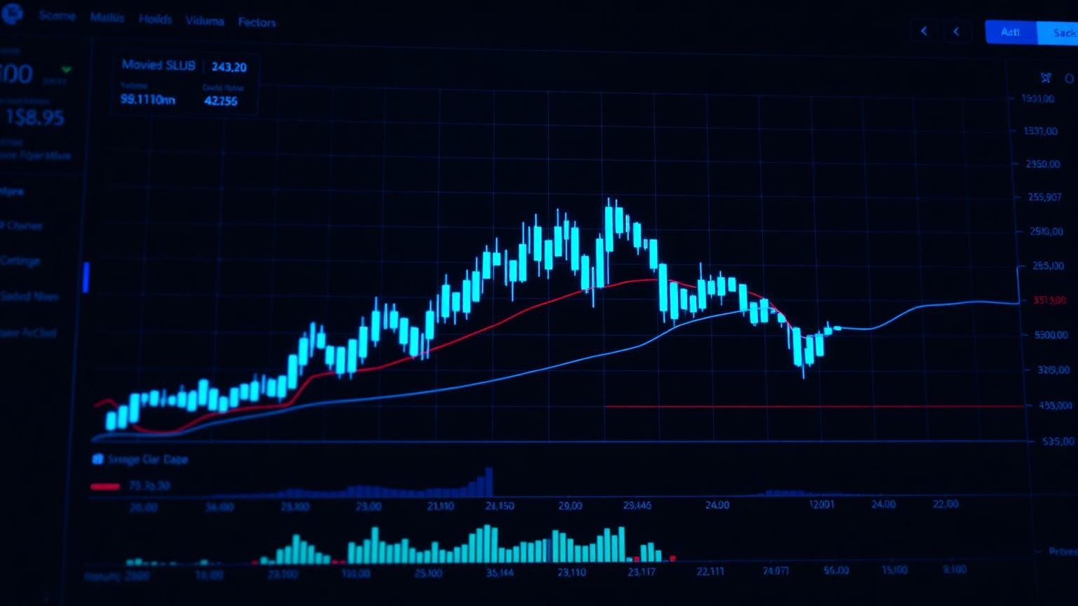
Candlesticks: the core unit
Most modern charts use candlesticks. Each candle summarizes one time period with four prices: the open, the close, the high, and the low. The thick part — the body — spans open to close. The thin lines — the wicks — show how far price stretched before settling.
- +A candle that closes higher than it opened is typically green (bullish).
- +A candle that closes lower than it opened is typically red (bearish).
- +Long wicks reveal rejection — price tried a level and got pushed back.
Trend: the most important thing on the chart
Before any indicator, name the trend. An uptrend makes higher highs and higher lows; a downtrend makes lower highs and lower lows; a range chops sideways between a floor and a ceiling. Most chart mistakes come from fighting the trend instead of reading it.
Support, resistance, and volume
Support is a price floor where buyers tend to show up; resistance is a ceiling where sellers tend to take over. These levels matter most when paired with volume. A breakout above resistance on heavy volume is far more convincing than the same move on a quiet day — volume is the conviction behind the price.
Moving averages and indicators
A moving average smooths price into a single line so the trend is easier to see. The 50-day and 200-day averages are the most-watched; when the shorter one crosses above the longer one, traders read it as momentum turning up. Indicators like RSI (overbought/oversold) and MACD (momentum) add nuance — but they're context, not crystal balls.
Pair the chart with the story
A chart tells you what price is doing; it can't tell you why. Combine technical reading with the fundamentals from our stock research framework, and sanity-check the narrative against who's actually talking about the name on the per-stock signal pages. When the chart, the fundamentals, and credible creator consensus line up, you have a real thesis instead of a hunch.
Frequently asked questions
How do you read a stock chart for beginners?
Start by naming the trend (up, down, or sideways), then read candlesticks to see who's winning each period, and use volume to gauge conviction. Support and resistance levels show where price tends to turn.
What do the colors on a stock chart mean?
Green (or white) candles usually mean price closed higher than it opened; red (or black) candles mean it closed lower. The body shows the open-to-close range and the wicks show the highs and lows.
Can chart reading predict stock prices?
No. Charts reveal patterns in past behavior and current momentum, which helps with timing and risk — but markets move on future information that no chart contains. Use it alongside fundamentals, not instead of them.